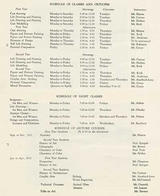
This inspiring article ("How To Pick An Animation School") at the ASIFA-Hollywood Animation Archive shows us how all those classic animators and cartoonists got to be so good. Along the way this post confirms what we've always suspected... the road to greatness in cartooning or any other craft is paved with lots of study, hard work, curiosity and perseverance. We can't afford to ever stop learning!
ASIFA-Hollywood Animation Archive: Theory: How To Pick An Animation School
On Newsstands Now: New SpongeBob Magazine Cover
Posted by Admin at 6:28 PM 0 commentsIt's been a while since I did storyboards on the SpongeBob
The three sketches below are my first attempts to draw SpongeBob
Well, it turns out there's not enough room on the cover to have that bubble so far from his face, so I had to try to have SpongeBob facing frontward, with the bubble overlapping his face, but without obscuring his smiling features!
This took quite a bit of pencil wrangling, but by the time I drew the two sketches below, I thought it was working OK. The sketch on the left is the one went with, but I kept drawing. Even after I think I've nailed it, I try to do more drawings to see if something unexpected happens. In this case, the next drawing I did wasn't as good, so I decided to take the good one and scan it in so I could play around with the composition.
This took quite a bit of pencil wrangling, but by the time I drew the two sketches below, I thought it was working OK. The sketch on the left is the one went with, but I kept drawing. Even after I think I've nailed it, I try to do more drawings to see if something unexpected happens. In this case, the next drawing I did wasn't as good, so I decided to take the good one and scan it in so I could play around with the composition.
Next, I threw in a whole buncha bubbles to show that SpongeBob has been having a great time amusing himself with his boundless bubble creativity. His bubbles were supposed to reflect his hopes, dreams, wishes and obsessions. I used TV Paint 8.5 tough up the sketch and cobble all the bubble drawings together into this pretty-much-finished pencil drawing below:
After submitting the above pencil drawing to Nickelodeon Magazine, the editors just asked me to change SpongeBob's eye direction. Originally they wanted him looking right at the "camera," but now they wanted me to have him looking at the bubble. Okey-dokey...no problem. Here's the inked version (below). I do all this sort of inking in Adobe Illustrator, using the freehand brush tool.
Finally, I "painted" the background using some pieces from stock backgrounds from the series that were painted long ago. I added the flower clouds by hand, and then blurred them in Photoshop. The hard part was getting the bubbles to look right; Each one has four layers with various transparencies. The flat colors on SpongeBob were done with the eyedropper and paint bucket tools. I sample the colors off of SpongeBob stock model sheets to make sure they're 100% accurate.
I had to leave a lot of room around the character for the Nick Magazine staff to put in all the headlines and bar codes and stuff. I kept all the bubbles on separate layers, giving the art director the freedom to move them around and resize them depending on the needs of the layout. And there you have it:

Thanks to Tim Jones, Laura Galen, Chris Duffy and the Nick Mag staff for giving me this "cover shot!"
UPDATE! The first Tutorial Videos are posted!
Keep checking this list of tutorial videos for more!
here are the first eleven
Adobe Illustrator Cartoon Inking
tutorial videos:
#11 - Illustrator Digital Inking Finale tutorial videos:
Keep checking this list of tutorial videos for more!
Storyboard Art from The Mist and Mars Attacks
Posted by Admin at 9:32 PM 0 comments
Fangoria magazine has just published an online article that features some cool storyboard art by Pete Von Sholly from the new Stephen King and Frank Darabont horror flick, The Mist.
I really like the way these pages look...they read very clearly. Even though they're rendered and shaded, the line work still looks fast and loose. You can see more at:
http://www.fangoria.com/news_article.php?id=5535
Cartoonist and storyboard artist Pete Von Sholly also has his own website where you can see some storyboard art from Mars Attacks:
http://www.vonshollywood.com/marsbdsindex.html
Find out more about this prolific storyboard artist at: http://www.vonshollywood.com/pvs.html
*****
Wanna know HOW to storyboard?
...then please take a minute to fill out this
Storyboard Course Poll
at
http://HOWtoSTORYBOARD.com
...then please take a minute to fill out this
Storyboard Course Poll
at
http://HOWtoSTORYBOARD.com
Subscribe to:
Comments (Atom)
